K

Agility Dashboard

Company

ClearlyAgile

My Role

  • UX Writing
  • Information Architecture
  • UI Design
  • Visual Design
  • IxD
  • Design for Accessibility
  • HTML/CSS/SASS within an Angular environment

Summary

I redesigned the layout, helping to bring user centered design sensibilities to Agility Dashboard.

Other Team Members

  • Full-stack Developer
  • Scrum Stakeholder
  • Scrum Product Owner
  • Scrum Master
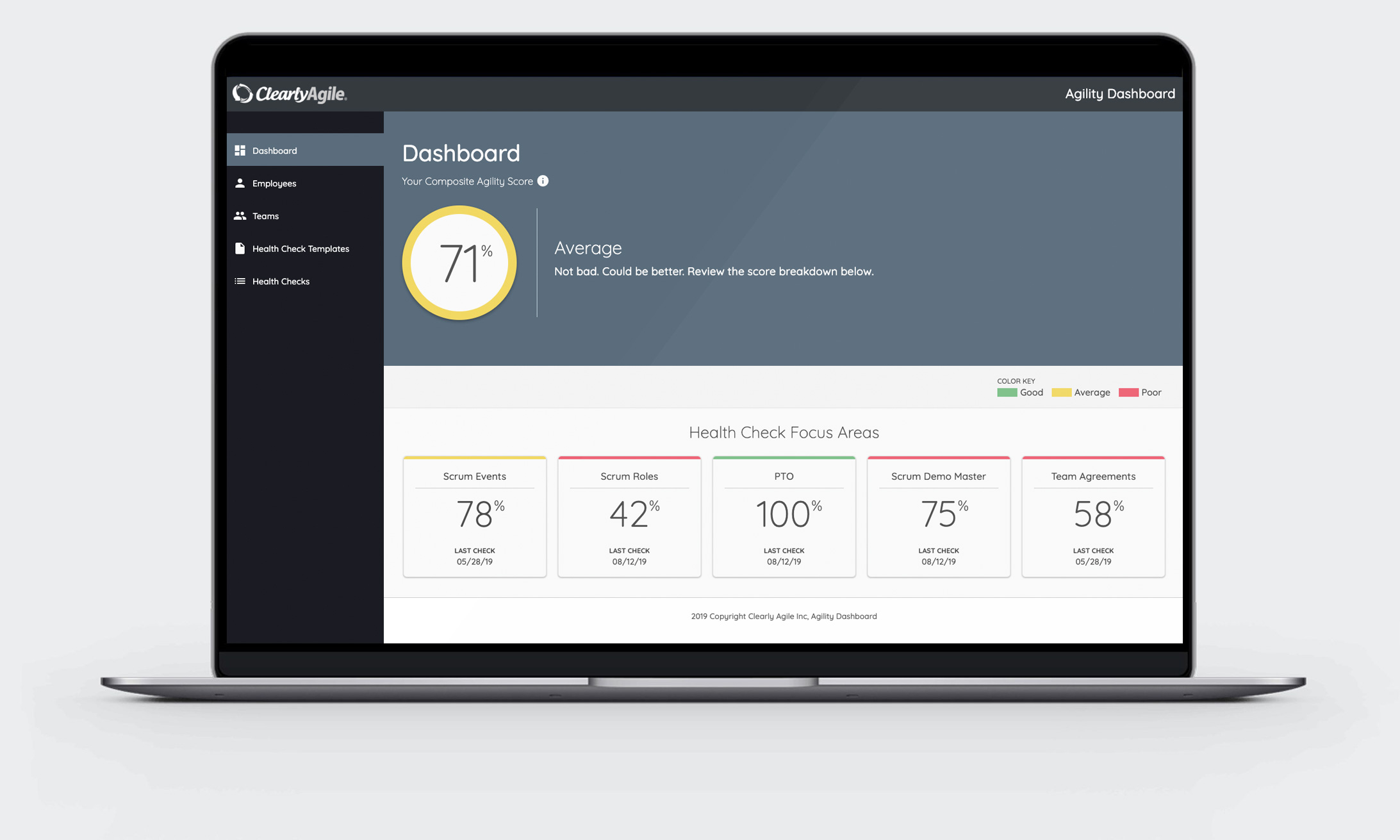
Image showing Agility Dashboard on a laptop screen

Background Info

Developers on my team were in the process of building the Agility Dashboard, a desktop app designed to help organizations measure and monitor their health in terms of applying Scrum methodologies. The app comes up with a composite score that answers the question "How are we doing?".

A previous UX Designer had worked on some static mockups for several app screens. The development team had deviated from them, experimenting on the fly as needs changed and at the behest of the main stakeholder and product owner.

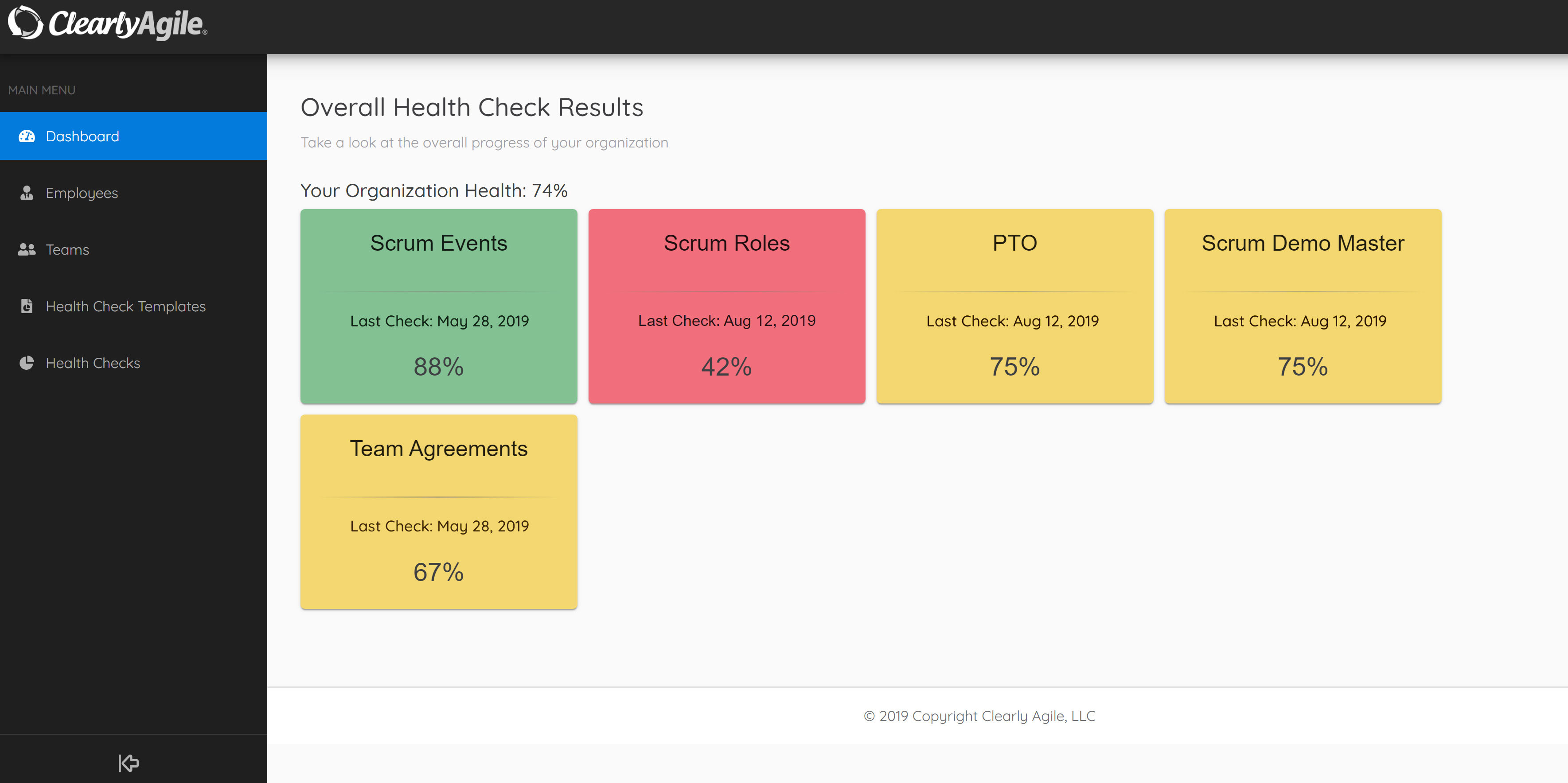
The problem was that although the screens functioned properly, many parts of the app were confusing, lacked helpful labeling, had little to no visual hierarchy, and was missing the desired friendly tone in its messaging.

Initial Design (Before redesign)

Dashboard

Initial layout before redesign

UX Challenges

  1. There was no established style guide.
  2. The product owner was new to this product as well, so guidance in certain areas was missing.
  3. The team is developer-first, developer-centric.
  4. The team uses Scrum, so UX processes related to user needs and business outcomes were hard to implement.

UX Solutions

  1. Rewrite labels and descriptive text.
  2. Establish a visual hierarchy.
  3. Decrease the reliance on color to communicate key information.
  4. Add visual cues to give users context and the ability to decipher unclear parts of UI.
  5. Use progressive disclosure to reduce cognitive load.

Execution

  1. I built a proof of concept in code from scratch to help convey ideas.
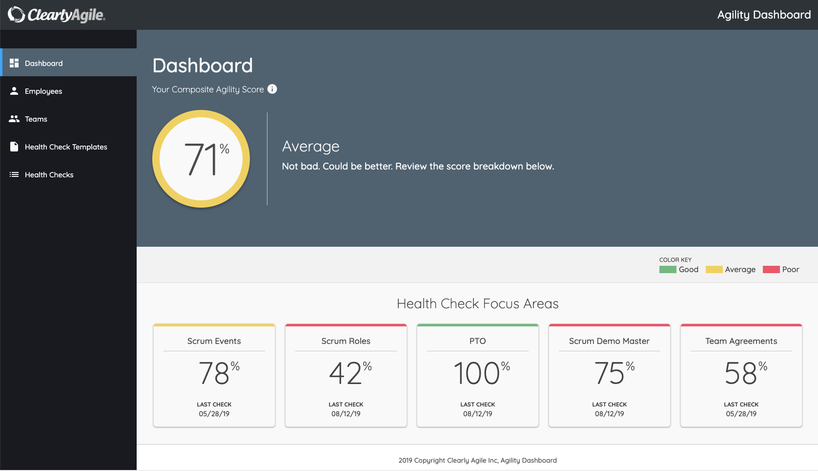
  2. I came up with the term “Composite Agility Score”, as the previous term “overall progress" wasn’t completely clear.
  3. I edited much of written descriptions for clarity and brevity.
  4. I added visual cues (percentage symbol, info icon) and a popover to help make things more clear.
  5. I added a color key to provide more meaning to the colors and the percentage score.

Final Design

Split View of Dashboard Screen

Learnings and Next Steps

Even in an iterative, Scrum based environment, it's important to establish shared understanding (e.g. about business problems, solutions, user pain points, etc.) early in your product design process. No process is absolutely perfect at delivering a product, especially when development has begun.

UX Design isn’t really meant to be implemented in the middle or at the end of development. Moreover, one can avoid wasting thousands of dollars in development costs by getting having a clear vision up front, getting users involved early, and having a more design infused culture in your product development cycle.

Ultimately, the company shifted gears, deciding to go another direction regarding process and team.

email kmbutlerx [at] gmail.com

chevron_right