K

Amazon Gift Cards Landing Page Redesign

An abridged case study

Company

Amazon

My Role

  • Design lead
  • Discovery
  • Design audit
  • Usability research
  • Copywriting + UX Writing
  • Information Architecture
  • Content design

Other Team Members

  • Marketing Manager (Main stakeholder)
  • Product Manager (PM)
  • Production Designer
  • Copywriting (consultation)

Summary

The page owner (Marketing Manager) sought a redesign of the gift cards (GC) homepage for the North America market. However, they didn't quite know what they wanted or why. There's no established branding or art direction for the gift business, though some of it rolls up to the parent Retail brand.

For the sake of this case study, I'm primarily focusing on desktop, since the biggest UX problems were there. Mobile mocks are available upon request.
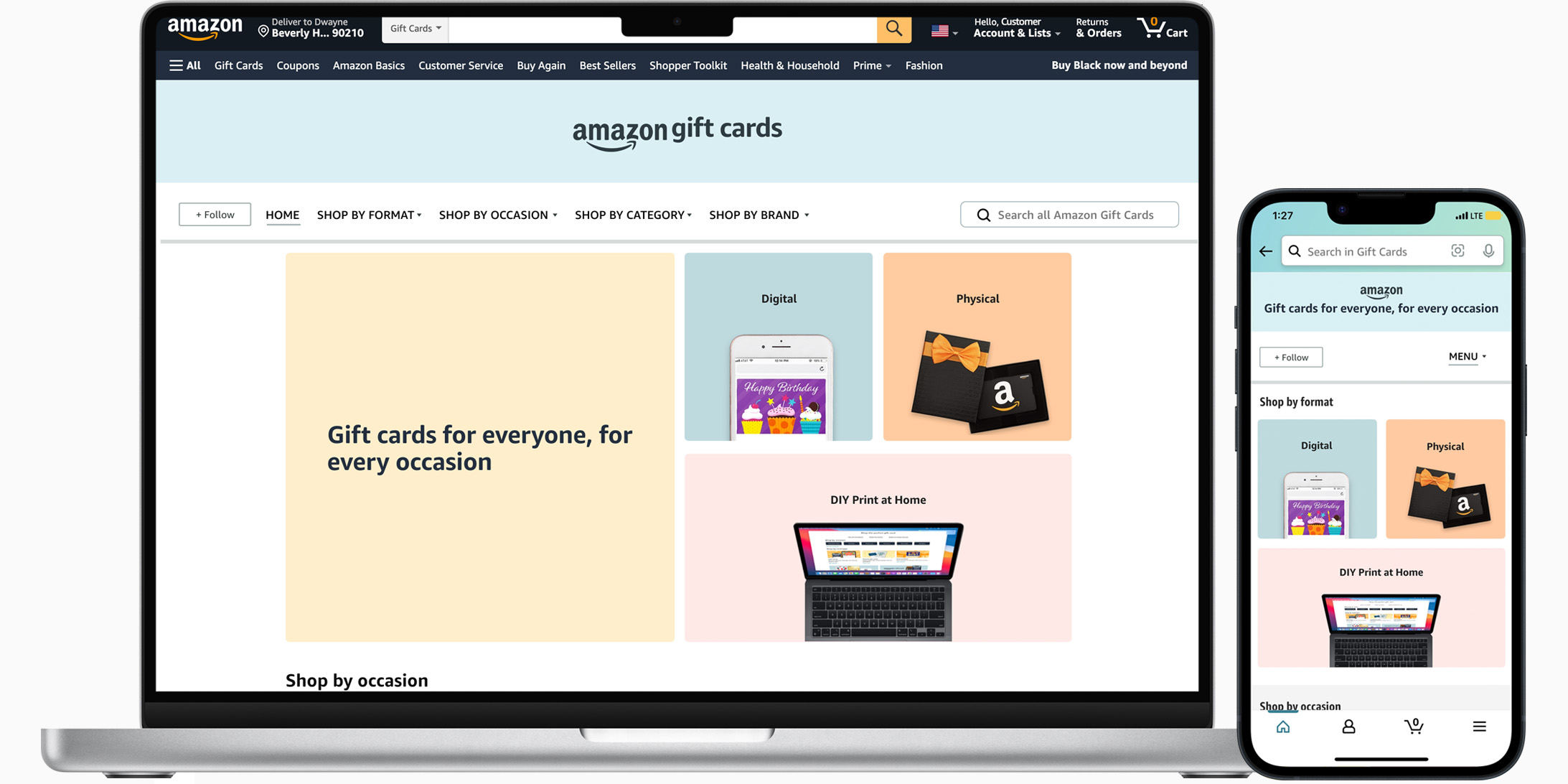
Final Design


Final design of gift cards landing page

(See hi-fidelity MVP and the final full-size design below.)

Background and Discovery Info

Upon project kickoff, the project stakeholder's chief goal was to increase engagement (increasing impressions), however, he didn't know why that was important or how that impacted his part of the business.

Moreover, when asked about specific customer problems that needed solving, he was aware of none. The stakeholder was somewhat junior and was new to this business unit. Other collaborators who joined the project were new the business unit as well.

Meanwhile, upon first viewing, it was clear to me that from a UI and usability perspective, the existing homepage didn't meet the design bar and might benefit from a redesign. However, there was still no customer-focused reason “why” I would do a redesign. Moreover, I'd become aware of problems with search tools in times of finding Amazon gift cards on the website.

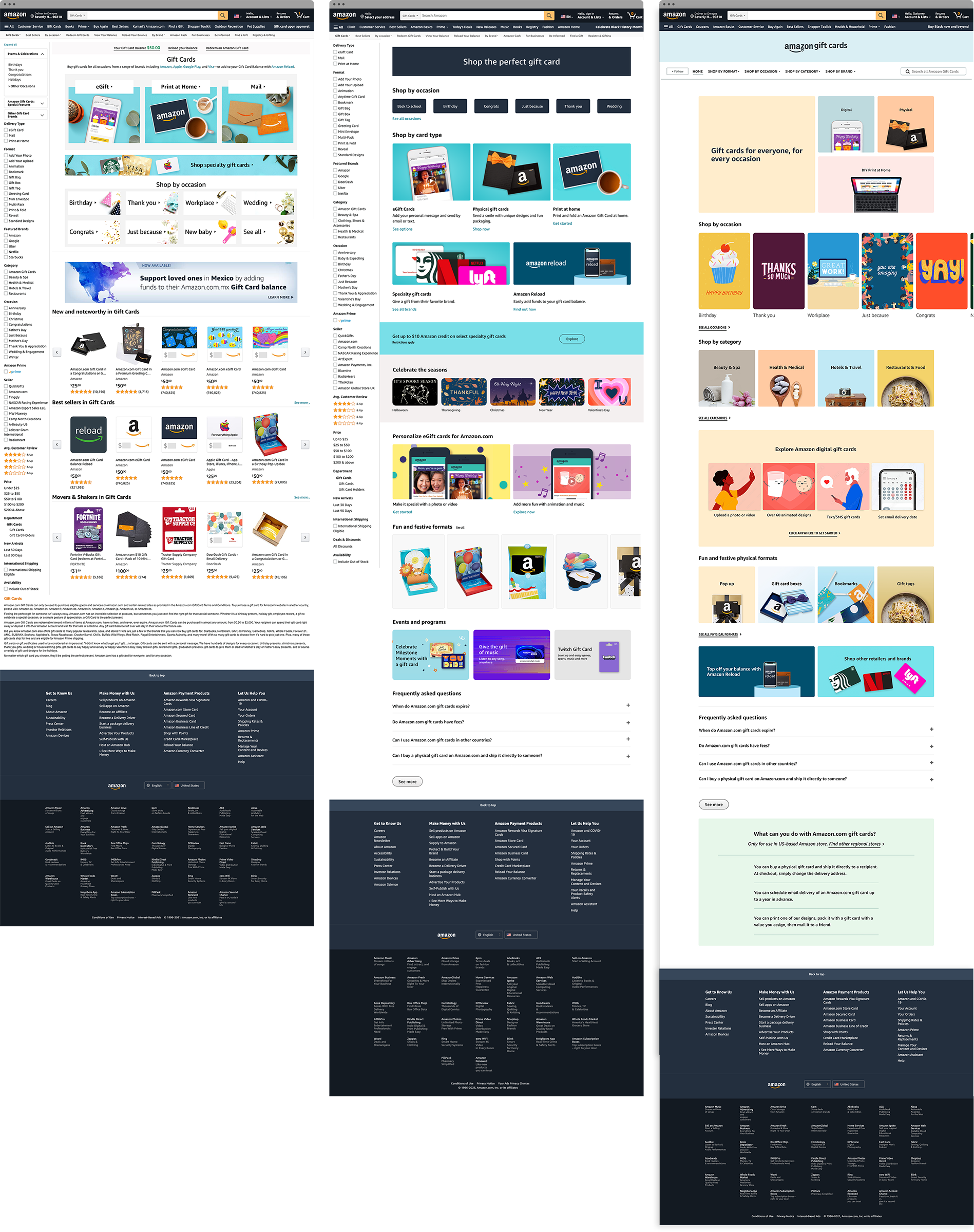
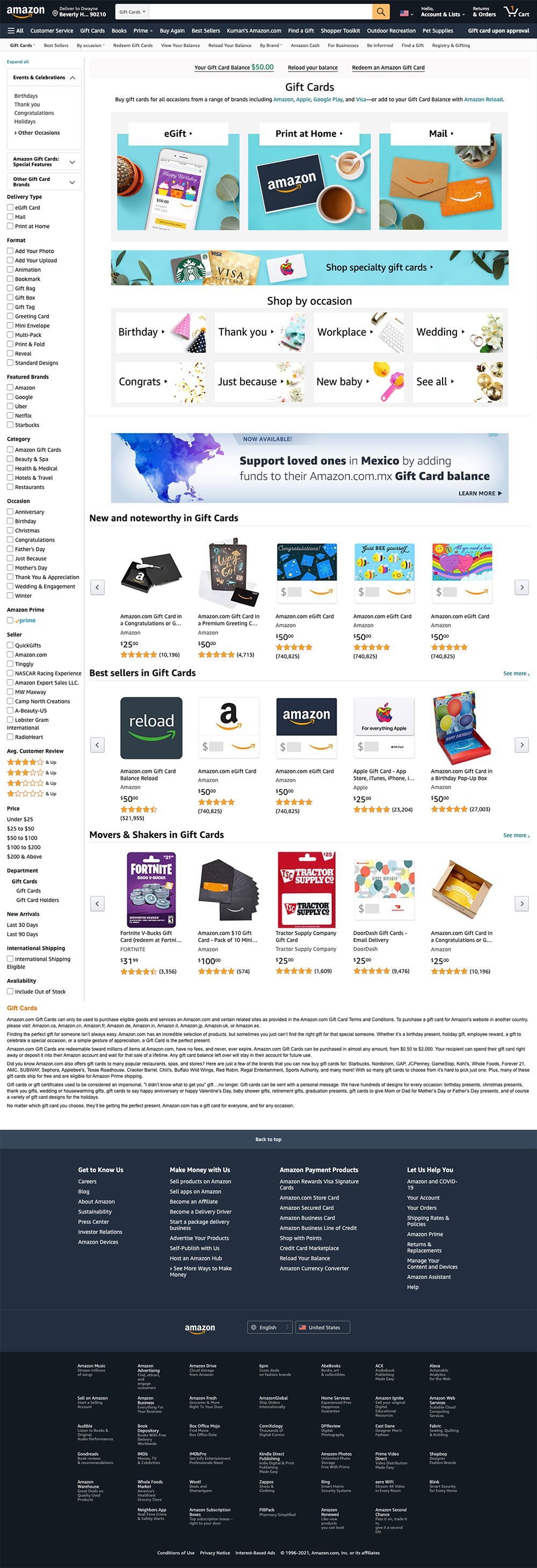
Existing Homepage Before Redesign

Desktop

before, after, and future states of gift cards landing page

UX Challenges

  1. Business goals and needs for the redesign were not defined.
  2. There was no content strategy or owner of said strategy. Moreover, Marketing assumed the UX team creates the content strategy.
  3. No PM to kickoff project; no PM ownership of product positioning or messaging. When a PM joined the project, she added no clarity around business needs or strategy.
  4. Stakeholder didn't know where to start and was very risk averse. It was clear at kickoff that I'd have earn their trust, even though Design is seen as an important business function at Amazon.
  5. Stakeholder didn't trust the judgement of the UX team. I was asked to provide evident for the most basic UX rules of thumb. Moreover, the stakeholder didn't understand that sometimes, UX designers are capable visual designers, copywriters, and FEDs.
  6. Stakeholder was new to design, not understanding design or of what the UX team offers.
  7. The business tends not to think "mobile-first" nor content-first.
  8. There was little to no usable existing data in terms of page engagement, customer pain points, etc.
  9. Adding more senior Marketing collaborators didn't bring clarity to the project brief.
  10. When asked, marketing stakeholders were unfamiliar with writing value propositions or positioning statement.
  11. A focus low-hanging fruit and not fix the systemic business and experience debt.
  12. No SDEs available to fix parts of the UI that weren't editable by the CMS.

UX Approach

  1. After the initial discovery phase, I completed a design audit to document the UX friction points. As a conversation-starter, I created wireframes and presented potential fixes for the more egregious friction points.
  2. When I demonstrated certain UX problems, the main stakeholder remained risk averse, only wanting to tackle low-hanging fruit and test incremental changes through a weblab.
  3. In parallel, I created a quick usability study, launching it on UserTesting.com, to see, in part, how current customers use the existing homepage and if they could successfully complete key tasks. (They couldn't.)
  4. I presented initial findings of customer pain points to the stakeholder and PM, who now agreed that my initial judgements were accurate. More feedback was pouring in, even feedback from shadow stakeholders
  5. I created a high-fidelity mock featuring short-term fixes. I aimed to refactor the existing artwork and use the same HTML backbone to limit the effort required to make the proposed changes. After including everyone's feedback, the new iteration was a design-by-committee disaster.

UX Approach, continued

  1. Understanding that trust still wasn't quite there, I created a second high-fidelity mock, in parallel, using my design perspective and acumen (Fig. 1)

    The new design still featured a lowlift set of enhancements based on the old design. The aim was low effort. It would take a few hours for the Production Designer to refactor existing artwork.

    It features a clear starting point and value proposition, simplified graphics and promotions/ads, live HTML-based text to help SEO and accessibility, clear product labels, concise product descriptions, robust visual hierarchy, all which the stakeholder loved.
  2. During, this time, the senior marketing stakeholder switched the aim of our project from a full-fledge redesign to short-term fixes as the holiday peak period approached. I was aligned with this decision, understanding the redesign would happen in Q1.
Fig. 1: Design backed by usability research
Full View of Homepage Redesign

Final Design


In parallel, I worked on a full redesign where I prioritized fixing the egregious UX friction points.

UX Approach

I leveraged a show-and-tell content strategy where I showed off beautiful card art and added simple self-evident labels for way-finding and product positioning. This modular layout lends itself to responsive layouts for tablet and smartphone and also creates more natural spaces for ads to live. Here's some more of what I did:

  • Used a bright color palette to create the illusion of more space. These colors act as a canvas on which product art sits.
  • Created a more robust visual hierarchy simplified product labels
  • Removed navigation redundancies
  • Surfaced key selling points of under-utilized products
  • Added new sections that surfaced key information for first-time users

Desktop

Full View of desktop Homepage Redesign

Contact Me

email kmbutlerx [at] gmail.com

KM Butler Copyright 2013 - 2025

chevron_right