K

Header + Product Page Redesign

Amazon Incentives

(Full case study coming soon)

Company

Amazon

My Role

  • Design lead
  • Discovery
  • Design audit
  • Copywriting + UX Writing
  • Information Architecture
  • Content design

Other Team Members

  • Marketing Manager (Main stakeholder)

Summary

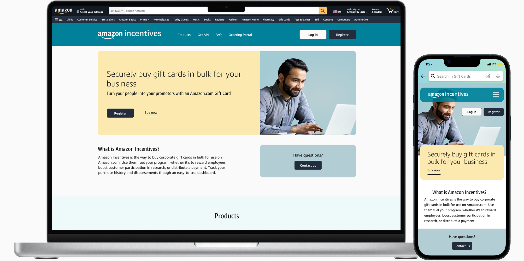
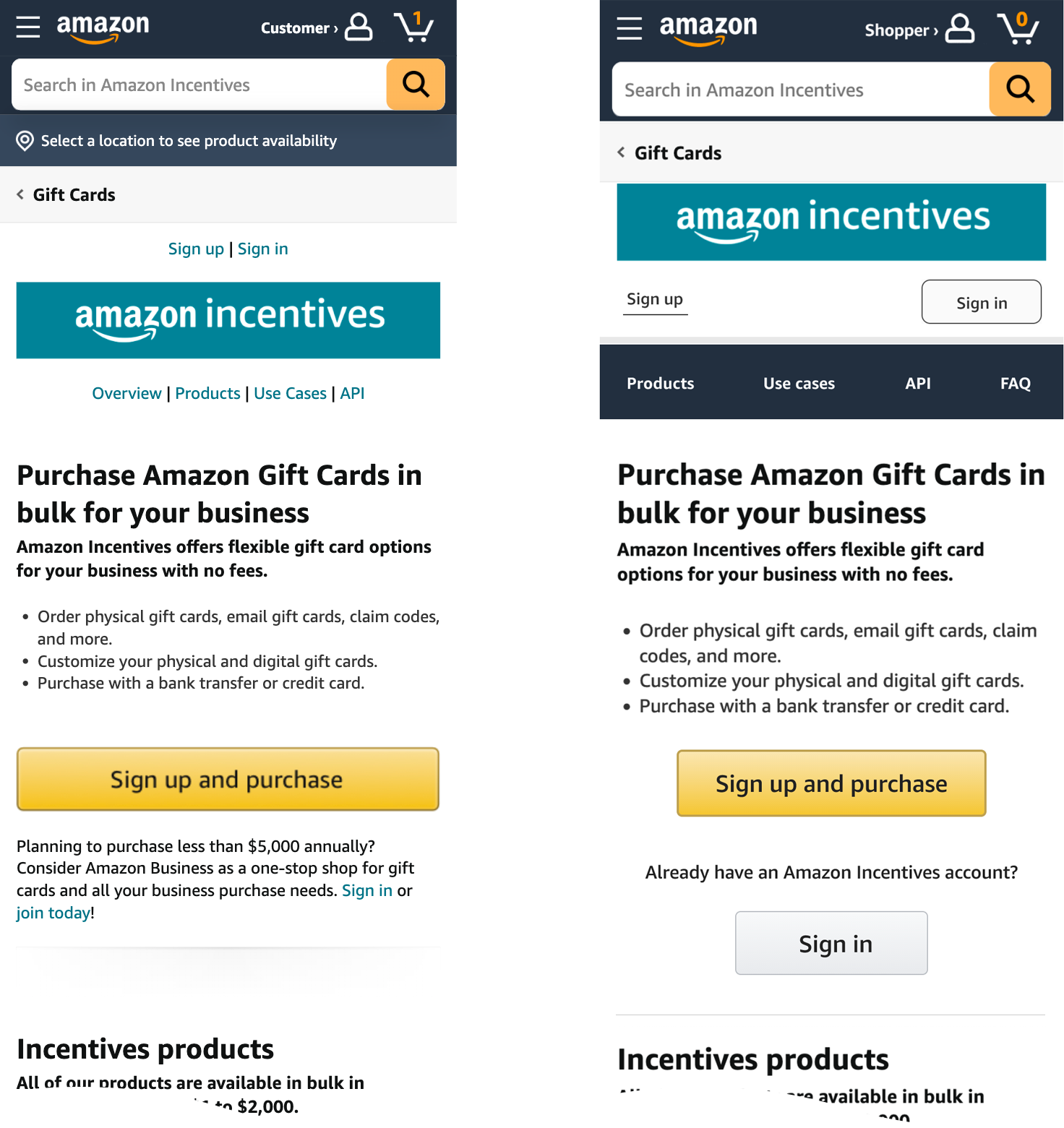
The page owner (Marketing Manager) reported that customers were having a hard time logging in, especially those coming form their Amazon Business account.

A quick audit of the page revealed confusing login and registration options, inaccessible and hard to read navigation, confusing CTAs for Amazon Business customers, and more.

I focused on quick fixes for the header first then moved on to recommendations for a full redesign.

Final Design


Final design of gift cards landing page

Background and Discovery Info

I conducted a design audit to uncover some usability issues related to logging in, logging in from using an Amazon Business account ID, visual hierarchy, and dark UX patterns related to manipulative CTAs and hidden content.

Time was tight and stakeholders hadn't budgeted for research. So, after a design audit, I used my judgement to quickly mock up quick fixes for the header and navigation for mobile and desktop.

Eventually, I created a speculative visual redesign and added a new value proposition which helps center the first-time user and to give clear affordances to returning users. One key change relates to content design and the prioritization of what needs to be communicated. The old design attempts to tell the user every detail upfront and "above-the-fold", which creates clutter, confusion, and feelings of being overwhelmed.

Quick Fixes for Mobile

Before and After


before, after, mobile devices

Old Design

Desktop

before, after, and future states of gift cards landing page

Final Design

Full View of desktop and mobile Homepage Redesign

Contact Me

email kmbutlerx [at] gmail.com

KM Butler Copyright 2013 - 2025

chevron_right