K

University Dashboard

Company

ConnectWise

My Role

  • Research
  • Content Strategy
  • Art Direction
  • UX Design
  • UI Design
  • Interaction Design
  • HTML/CSS/Bootstrap Development

Summary

I designed and developed an interactive proof of concept using modular web UI components. This project was born out new insights uncovered during the empathy/discovery phase of a related project.

This was an exploratory project; It aimed at helping me and stakeholders think about unmet user needs, test market potential, think about MVPs, and align extended stakeholders and product owners.

Other Team Members

  • My Learning and Development Manager (Advisor, my supervisor)
laptop featuring Learner Dashboard

Background Info

ConnectWise University is a learning ecosystem that depends on legacy code and old ways of thinking. ConnectWise the company grew quickly, shifting as the market dictated. The University didn’t scale as fast as ConnectWise did, so parts of the learning platform was stuck in the past.

During the research phase of two related projects (Homepage Redesign and persona research), I uncovered user pain points, realizing that a dashboard of sorts, might be one part of a set of solutions. Generally, it could be a place where learners could manage certain University account settings, transcripts, degrees, and other administrative sundries.

Moreover, the University had become a catch-all for much of the Operations arm of the company. Departments like Support had published useful widgets to the University but very few people could find them. Where could these things be housed?

Users

User types include the technical and non-technical alike. They’re SMB providing managed and other IT services. Some of them are business owners, Technicians, people or operations managers, and software administrators.

User Pain Points

At the time, users couldn’t easily track their progress across degrees, certifications, or other learning materials and experiences. If they were an Admin, a user-type empowered to assign coursework to their teammates (co-workers), this was doubly frustrating. How could users see their entire learning history? They couldn’t.

Goals

  1. See how the user responds to being given more tools to manage their learning.
  2. Uncover unmet user needs
  3. Test market potential
  4. Align stakeholders and product owners.

UX Challenges

Since this project was more exploratory (read: designed to help us find the right questions to ask ourselves, the business, and users), the UX challenges were not apparent upfront. But we had some initial things to think about, including:

  1. Legacy processes and waterfall methodologies on the part of the Company would need to be addressed.
  2. The business has an overarching desire to rely on the community (participants in the customer base ecosystem) to vet, rate, and even create learning and Support materials. This would help decrease costs to ConnectWise. What types of systems would we need to create to support this? Might a learner dashboard be the first steps to making this a reality?
  3. How might we provide for a diverse user base?
  4. Are users most interested in facts and figures or do they want to do something with that info?
  5. How might gamifying learning experiences drive usage and increase adoption? How could we identify, categorize, label, and market the best and brightest thought leaders in our ecosystem? Do those people want to be known? Do they want to share their knowledge with people they compete with?
  6. Who owns the University? The Education Department? Leaders of the overarching Operations Business Unit?

UX Solutions

One goal of this proof was to understand how users might respond to being given more control over what they see and where they see it. With that, I sought to:

  1. Provide a flexible UI that consists of customizable modules.
  2. Empower users to reorder UI modules, add or delete modules, and adjust settings determining what shows up in modules.
  3. Conduct research with real users to mostly to test market need and secondly, usability.

Final Design

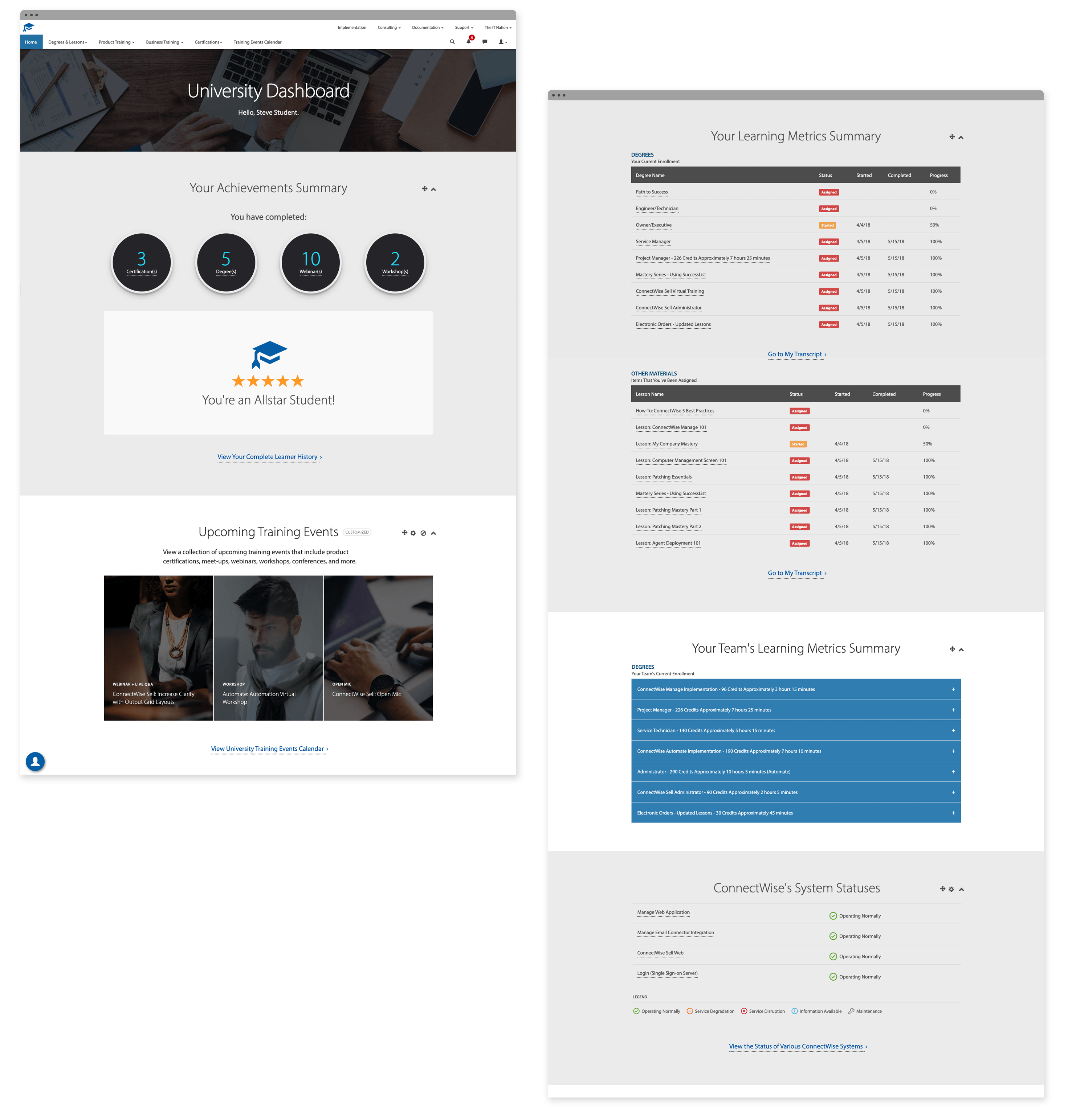
Split View of Dashboard Screen

UI Details and Micro-interactions

Sidebar Shortcuts

Collapsible and Draggable UI Modules

Settings to Control What Upcoming Events Display On the Dashboard

Usability, Viability

Usability Testing

After I built a working prototype, I tested market fit and usability. The users were a mix of people who completed coursework on their own and admins (those responsible for assigning coursework to others).

I gave users specific tasks using the dashboard. I had them speak aloud as I recorded their faces, computer screens, and voices as they completed the tasks. This gave me somewhat of a good idea of the users thought as they used the UI.

User Reactions, Stakeholder Realizations

Overwhelmingly, users loved the dashboard, as it addressed many unseen issues. We realized a few things in the process:

  1. Users wanted to not only see this type of info on a dashboard but also wanted the means to export and share the reports.
  2. We’d need to colocate all user University account settings and other scattered experiences.
  3. The Education Department (the team that owns the University) needs tighter alignment with the Business Ops Team. Business Ops creates University user accounts for new customers right before the onboarding and implementation processes. New users are typically given access to the University with no formal orientation.
  4. We’d need to ensure that our technology stack could support this.

Next Steps

The two primary stakeholders are learning professionals (one of them is the product owner). They noticed certain tools were missing from the University ecosystem. Both loved the idea of the dashboard and saw a need for its features. They were excited to see what users would say.

They both agree to add further research and development to the roadmap as they shopped the prototype to their bosses.

Contact Me

email kmbutlerx [at] gmail.com

KM Butler Copyright 2013 - 2025

chevron_right